By Yassine Tazi
When it comes to building a fast, beautiful, and user-friendly website, images can be your best friend or your worst enemy.
Optimized images can cut loading time in half, boost your Google rankings, and deliver a smoother experience for your visitors. On the flip side, unoptimized images can slow down your site, frustrate users, and even hurt your SEO.
So how do you strike the right balance between quality and performance?
That’s exactly what this guide will show you.
Whether you’re a web designer, a blogger, a developer, or an eCommerce owner, this guide is packed with actionable tips to help you:
- Choose the best image formats for your needs
- Compress and convert images without losing quality
- Improve page speed and Core Web Vitals
- Avoid the most common mistakes in image handling
And the best part? You don’t need to be a tech wizard to do it.
By the end of this guide, you’ll have a clear understanding of what image optimization really means, how it impacts your site, and which tools (like Toconverted.com) can simplify the entire process for you.
Why This Guide Matters
- Faster websites = better user experience
- Google rewards optimized content
- Mobile users demand speed and responsiveness
- Higher performance leads to better conversion rates
Let’s dive into the essentials and turn your site into a faster, more efficient experience—without sacrificing visual quality.
What Is Image Optimization and Why Does It Matter?
Image optimization is the process of reducing the file size of your images without noticeably affecting their quality.
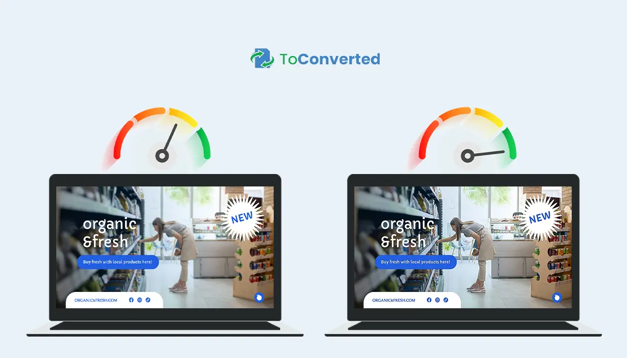
The goal? To create faster-loading, better-performing websites, without sacrificing visual impact.
In other words: it’s about working smarter with your visuals, not harder.
Whether you're uploading blog post thumbnails or full-width banners on an eCommerce page, optimizing those images is a small task that leads to big results.
Let’s break down exactly why it matters
Website Speed and User Experience
Nobody likes a slow website. In fact:
- 53% of mobile users will leave if a site takes more than 3 seconds to load.
- Images often make up over 50% of a page’s total weight.
That’s why reducing image file sizes by choosing the right format, compressing properly, and resizing is critical.
Benefits of faster image loading:
- Smooth, snappy browsing for visitors
- Lower bounce rates
- Higher chances of users exploring more pages
Tip: Use next-gen formats like WebP or AVIF to drastically reduce image size without killing quality.
SEO and Google Rankings
Search engines love fast websites. Page speed is now a ranking factor in Google’s algorithm.
Unoptimized images can slow down your site, damaging:
- Core Web Vitals (especially Largest Contentful Paint)
- Crawlability (Google may skip heavy pages)
- Mobile-first indexing performance
By optimizing images, you’re not only improving user experience, you’re also telling Google your site is worth ranking higher.
Pro SEO tips:
- Add descriptive alt text with keywords
- Serve scaled images that fit container sizes
- Lazy-load off-screen images to save resources
Mobile Responsiveness and Performance
With over 60% of traffic now coming from mobile, image optimization isn't just nice to have, it’s essential.
Large desktop-sized images served to mobile devices waste bandwidth and crush performance. To fix this:
✅ Use responsive image techniques (srcset, sizes)
✅ Serve images in smaller dimensions for mobile
✅ Optimize for both retina and standard displays
A mobile-friendly site with optimized visuals:
- Loads faster on cellular networks
- Uses less data (great for user retention)
- Ranks better on mobile search results
Final Thoughts on Why It Matters
If your site is slow, heavy, or not mobile-optimized, images are usually the culprit. Thankfully, they're also one of the easiest things to fix.
Image optimization is one of the fastest wins you can achieve for both UX and SEO, and tools like Toconverted.com make it even easier.
Choosing the Right Image Format
Not all image formats are created equal.
The right choice depends on how you plan to use the image, how much quality you need, and how important performance is for your website.
Let’s explore the most common (and powerful) formats—and when to use each one.
JPG vs PNG vs WebP: Pros and Cons
These three are the heavyweights of the web. Here's how they compare: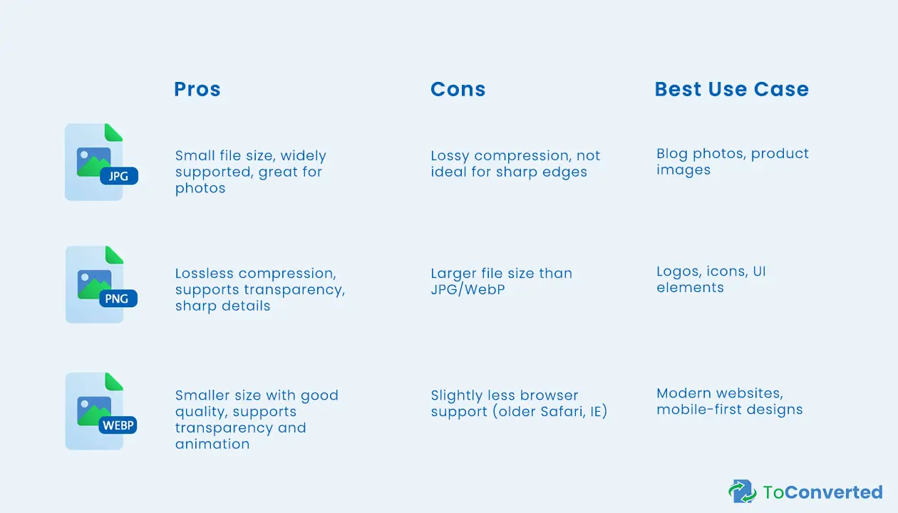
Quick Tip: If you want faster load times without losing too much quality, WebP is often the best choice.
When to Use SVG for UI and Logos
SVG (Scalable Vector Graphics) isn’t a traditional image file; it’s a code-based format that scales perfectly at any resolution.
Why SVG is a game-changer:
- Crisp and clean at any size (great for retina displays)
- Editable with code (colors, shapes, animations)
- Super small file sizes for simple designs
✅ Use SVG when:
- Designing logos, icons, or UI elements
- You want fast loading and sharp rendering
- Accessibility and responsiveness are key
🚫 Avoid SVG for:
- Complex images like photographs
- Graphics with textures or gradients
AVIF and New Image Formats in 2025
The future of image optimization is here, and it's getting even better.
AVIF (AV1 Image File Format) is a next-gen format designed to replace even WebP in many scenarios.
AVIF Benefits:
- Up to 50% smaller than JPG and WebP
- Excellent quality at low sizes
- Supports transparency and HDR
But… It’s not perfect (yet):
- Limited support on some older browsers
- Slower encoding (for now)
Other formats to keep an eye on:
- HEIC: used in iPhones (great for photos)
- JPEG XL: gaining traction for lossless compression + backward compatibility
Pro Insight: If you’re working with cutting-edge websites or high-performance apps, AVIF might be your best bet—just make sure to include fallback images.
Final Thoughts: Format Choice Matters
Choosing the right image format isn’t just a technical decision ,it’s a strategic one.
The wrong format can slow down your site, look blurry on mobile, or ruin transparency effects.
But with the right choice, you get clarity, speed, and a professional visual experience.
Use Toconverted.com to quickly convert and optimize images into the right format, all in one step.
Image Compression Techniques
Image compression is where real performance gains happen. It’s the art of making your images lighter—without making them look worse.
Whether you're preparing product images, blog illustrations, or website backgrounds, knowing how to compress images effectively can save bandwidth, improve loading speed, and boost SEO.
Let’s dive into how it works and how to do it right.
Lossy vs Lossless Compression
The first thing to understand is the two types of compression—and when to use each:
📉 Lossy Compression
- Reduces file size by removing data
- Some loss of quality, often unnoticeable
- Ideal for photos and web graphics where size matters
✅ Use when:
You want maximum performance with acceptable quality (e.g., hero images, blog visuals)
Lossless Compression
- Preserves all original image data
- No loss in quality
- Files are typically larger than lossy versions
✅ Use when:
You need crystal-clear visuals, transparency, or editable formats (e.g., PNG logos, SVG graphics)
Tip: Always preview your image after compression. Don’t overdo lossy compression—it may cause blurriness or pixelation.
Recommended Tools (Yes, Including Toconverted.com)
You don’t need Photoshop or complex software to compress images properly.
Here are top tools trusted by designers, bloggers, and developers:
Online Tools:
- Toconverted – Free, fast, and no signup. Convert and compress images in one step, whether you’re working with JPG, PNG, WebP, or PDF.
- TinyPNG – Great for batch PNG/JPG compression.
- Squoosh – Browser-based, supports advanced settings like AVIF, MozJPEG.
Software:
- ImageOptim (Mac) – Ideal for local batch compression
- RIOT (Windows) – Lightweight and customizable
💡 Why use Toconverted.com?
Because it simplifies the entire process:
✅ Upload your image
✅ Choose your format
✅ Compress and download — instantly.
No clutter. No learning curve.
Batch Compression for Workflows
If you manage a lot of images (think blogs, online stores, or client websites), manual compression just won’t cut it. You need batch processing.
Benefits of Batch Compression:
- Save time by compressing dozens—or hundreds—of images at once
- Ensure consistency in image size and quality across the site
- Prevent slowdowns when updating large galleries or content-heavy pages
✅ Ideal for:
- eCommerce owners with product catalogs
- Agencies working on multiple client sites
- Bloggers uploading regular visual content
Pro Workflow Tip:
Use Toconverted.com to convert multiple images in one go, then integrate into your CMS or website build process.
Wrapping Up: Smart Compression = Better Websites
Every kilobyte counts—especially when you’re optimizing for speed, SEO, and mobile performance.
With the right compression technique and tool (like Toconverted.com), you’ll reduce image weight without losing visual impact—giving your visitors a faster, smoother experience.
Image Conversion Best Practices
Image conversion isn't just about changing file extensions—it's about preserving quality, choosing the right format, and streamlining your workflow.
Whether you're preparing graphics for a client, compressing images for a blog, or building a presentation, following best practices ensures your visuals stay sharp, fast, and functional.
Convert Images Without Losing Quality
One of the most common concerns during image conversion is:
“Will my image lose quality?”
The answer depends on how and what you're converting.
Best practices to preserve quality:
- Always start with a high-resolution source.
Converting from low-quality images will only make things worse. - Choose formats that match your purpose.
- Use WebP or AVIF for the web
- Use PNG when transparency is needed
- Use SVG for scalable icons and UI
- Avoid multiple conversions.
Every conversion step can degrade quality, especially between lossy formats (like JPG → JPG).
Use tools like Toconverted.com to convert images once and correctly, without complex settings.
PDF Conversion for Presentations and Reports
Sometimes, images aren’t the final product—they’re part of a report, portfolio, or client presentation.
That’s where image-to-PDF conversion comes in handy.
- Combine multiple images into one neat, shareable file
- Great for professional documentation
- Keeps layout and resolution intact across all devices
Common use cases:
- Sharing design mockups
- Submitting image-based reports
- Creating printable presentations
✅ With Toconverted.com, you can:
- Convert JPG, PNG, WebP to PDF instantly
- Merge multiple images into a single document
- No software or plugins required
💡 Tip: When exporting to PDF, make sure images are compressed beforehand to avoid huge file sizes.
Automating Conversion Tasks
Handling a few images? Manual tools work fine.
But for professionals dealing with dozens—or hundreds—of files, automation is the key.
Automation helps you:
- Save time and avoid repetitive clicks
- Ensure consistent format and size across assets
- Integrate conversion into design or publishing workflows
Solutions for automation:
- Toconverted: Convert and compress batches of images quickly
- APIs: If you're a developer, integrate an image processing API into your platform
- Scripts or tools like ImageMagick for advanced users
Example Workflow:
A web designer can drop all product photos into one folder, convert them to WebP using a tool, and upload them directly to a CMS—compressed and ready.
Final Thought: Conversion Done Right = Professional Results
Poor conversion can ruin a great design.
With smart practices and the right tools, you’ll deliver high-quality visuals in the right format, every single time.
Don’t let conversions slow you down—optimize them with purpose using tools like Toconverted.com.
Responsive Images and Lazy Loading
Not all visitors experience your website the same way.
Some are on fast fiber connections and desktop screens. Others? They're scrolling through your content on a smartphone with spotty 4G.
To deliver a smooth experience for everyone, your images need to be responsive and efficiently loaded.
Let’s explore two essential techniques: srcset and lazy loading.
Using srcset and picture Elements
Responsive images adapt to the user's device, ensuring they see the best-quality version without wasting bandwidth.
The HTML srcset and picture elements allow browsers to:
- Choose the right image size based on screen width or resolution
- Serve lighter images for mobile and sharper ones for retina displays
- Reduce unnecessary data usage
Example using srcset:
<img
src="image-800.jpg"
srcset="image-400.jpg 400w, image-800.jpg 800w, image-1200.jpg 1200w"
sizes="(max-width: 600px) 100vw, 800px"
alt="Optimized Product Image">
Benefits of responsive images:
- Improve Core Web Vitals like Largest Contentful Paint (LCP)
- Serve optimized visuals to all screen types
- Lower bounce rates on mobile devices
💡 Tip: Use picture when you need different formats, like switching between WebP and JPG for browser compatibility.
Improve Loading Time with Lazy Load
Lazy loading is a technique that delays the loading of off-screen images until the user scrolls down to them.
This reduces initial load time and helps your page feel faster.
Why lazy load?
- Speeds up the first contentful paint
- Reduces bandwidth consumption
- Great for long pages, image galleries, or blog archives
How to implement:
- Use the loading="lazy" attribute in your <img> tag:
<img src="image.jpg" alt="Sample" loading="lazy">
- Most modern browsers now support this natively—no JavaScript required!
⚠️ Don’t forget:
- Always set image dimensions to prevent layout shifts
- Lazy load only non-critical images (not logos or above-the-fold content)
Better Images, Faster Websites
Combining responsive images with lazy loading is one of the smartest things you can do to boost speed and user experience—especially on mobile.
When paired with proper compression and format selection (see previous sections), your website becomes lighter, faster, and more professional.
And tools like Toconverted.com can help you prepare the right image sizes and formats in seconds.
Tools and Services for Image Optimization
You understand the theory. You know why image optimization matters.
Now it's time to talk about the tools that make it easy—and even automatic.
Whether you're a blogger, web developer, or eCommerce owner, the right tool can save you hours of manual work and help you deliver fast-loading, high-quality visuals consistently.
Let’s explore your options—from quick online converters to robust APIs.
Online Tools (Try Toconverted.com)
If you're looking for a fast, no-fuss way to convert and optimize images, online tools are your best friend.
Why use online tools?
- No software installation
- Quick drag-and-drop interface
- Ideal for one-time or light usage
Toconverted.com is a perfect example:
- Convert JPG, PNG, WebP, SVG, and more
- Compress images during conversion
- Generate PDFs from multiple images
- Mobile-friendly and 100% free to use
Bonus: It’s ideal for designers, content creators, and marketers who want clean results without hassle.
Other popular options:
- TinyPNG: Great for simple JPG and PNG compression
- Squoosh.app: Offers advanced settings (WebP, AVIF, etc.)
CMS Plugins (WordPress, Shopify, etc.)
If you use a content management system like WordPress, Shopify, or Magento, there are powerful image optimization plugins that handle everything behind the scenes.
For WordPress:
- Smush: Compresses and lazy-loads images automatically
- ShortPixel: Offers WebP conversion and bulk compression
- Imagify: Clean interface, great for beginners
For Shopify:
- TinyIMG: Compresses and converts images without extra effort
- Image Optimizer: Helps improve SEO and site speed with auto-compression
For Other CMS Platforms:
- Cloudinary plugins (for Drupal, Magento, etc.)
- EWWW Image Optimizer (multi-platform)
💡 Tip: Always check if your plugin supports next-gen formats (WebP, AVIF) and responsive image support.
Developer APIs
For high-volume websites, apps, or platforms that handle thousands of images, automation is essential—and that’s where image optimization APIs shine.
What can APIs do?
- Automatically convert and compress images at upload
- Resize and reformat based on device or screen
- Integrate directly into your CMS, app, or custom dashboard
Popular APIs:
- Cloudinary – Full-featured media management and optimization
- ImageKit – Fast CDN, real-time resizing, global delivery
- Kraken.io – Lightweight and developer-friendly
- Toconverted – A simple REST API to handle batch conversion and compression (optional teaser if planning to launch)
Example use case:
A developer building an online marketplace can use an API to convert all uploaded product images to WebP, resize them, and serve through a CDN—all without touching the backend.
Final Note: Choose Tools That Fit Your Workflow
The best tool is the one that integrates smoothly into your daily process.
For light, on-the-go needs, Toconverted.com is ideal.
For WordPress users, plugins save time.
And for high-traffic apps, APIs ensure performance at scale.
Whatever your level, there’s a solution that fits.
Image Optimization for eCommerce
In eCommerce, visuals aren’t just decoration—they're sales drivers.
From product thumbnails to zoomed-in views, every image plays a role in convincing the customer to buy.
But heavy, unoptimized images? They can slow down the user experience, hurt your SEO, and lead to abandoned carts.
Here’s how to make sure your product visuals are both stunning and performance-ready.
Product Image Guidelines
Shoppers expect crisp, professional images that load instantly—even on mobile.
To deliver that, you need to follow a few best practices when creating and uploading product images.
✅ Key Guidelines:
- Use the right format
- WebP or AVIF for lightweight performance
- PNG for images needing transparency
- Stick to consistent image sizes
- Helps create a clean and predictable layout
- Avoids resizing issues on product grids
- Compress images without killing quality
- Aim for under 150KB for product thumbnails
- Larger images (zoomed views) can go up to 300KB—but never more
- Name your files properly
- Use SEO-friendly names like black-leather-wallet.jpg
- Include product keywords when relevant
- Add ALT text
- Helps with SEO and screen reader accessibility
💡 Pro Tip: Use Toconverted.com to convert and compress all your product images before upload—no software needed.
Image CDN Solutions
If your store is growing or serving a global audience, image delivery can be a bottleneck.
That’s where CDNs (Content Delivery Networks) for images come in.
What is an Image CDN?
An Image CDN hosts, optimizes, and delivers your images through multiple edge servers around the world—automatically.
Benefits for eCommerce:
- Faster image loading regardless of user location
- On-the-fly resizing, compression, and format conversion
- SEO-optimized delivery with proper caching
- Bandwidth savings and better uptime during high traffic
🔧 Popular Image CDN Solutions:
- Cloudinary – Full media management, automation, and transformations
- ImageKit – Great performance with real-time resizing
- Fastly / BunnyCDN – General CDNs with image optimization options
- Shopify's built-in CDN – Automatically handles many of these features for you
Example:
Instead of uploading five different sizes of the same product photo, use a CDN like Cloudinary to serve one master image that gets resized and optimized automatically based on the user’s screen.
Boost Sales with Fast, Optimized Product Images
When it comes to online selling, speed and appearance are everything.
Optimized images load faster, look better, and build trust—leading to more clicks, longer browsing time, and higher conversions.
Don’t let heavy images slow down your store.
Use smart tools like Toconverted.com to optimize images before upload, and consider a CDN if you're scaling up.
Final Tips & Common Mistakes to Avoid
You've made it this far—so you already know how important image optimization is.
But even with the right tools and techniques, small missteps can still hurt your website’s performance or visual quality.
Here are the most common mistakes people make when optimizing images—and how to avoid them.
Over-Compressing Images
Compression is essential, but too much of it can do more harm than good.
❌ What happens when you overdo it?
- Images become blurry or pixelated
- Loss of detail makes your brand look unprofessional
- Customers may feel less confident in your product or service
✅ How to avoid it:
- Use lossy compression carefully—preview the results before uploading
- For key visuals (like hero banners or product images), go for balanced compression
- Try WebP or AVIF instead of lowering JPG quality drastically
💡 Tip: Tools like Toconverted.com automatically apply smart compression levels to preserve clarity while reducing file size.
🚫 Using Wrong Formats
Picking the wrong format is one of the most overlooked mistakes in image optimization.
❌ Common slip-ups:
- Using PNGs for full-size photos (makes the file unnecessarily heavy)
- Using JPGs for logos (blurry edges, no transparency)
- Not taking advantage of WebP or SVG where applicable
✅ Smart format usage:
- JPG: Best for rich photos or detailed graphics
- PNG: Use when you need transparency
- WebP: Great for modern browsers—smaller and faster
- SVG: Perfect for icons and UI elements
- PDF: Ideal for downloadable content like reports and portfolios
Choosing the right format = better visuals + better speed.
Ignoring Retina Displays
High-resolution screens are now everywhere—on phones, laptops, tablets, even watches.
❌ Mistake:
Uploading low-res images that look sharp on standard screens, but appear blurry or fuzzy on retina displays (2x pixel density or higher).
✅ Fix it with:
- 2x versions of key images (like logos or banners)
- Using SVGs for icons and interface elements—they scale perfectly
- Serving responsive images with srcset to adapt to screen density
💡 Pro Tip: Make sure your visuals stay crisp on both standard and high-DPI screens—this creates a premium feel that visitors notice.
Wrap-Up: Optimize Smart, Not Just Hard
Image optimization isn’t just about shrinking file sizes—it's about finding the right balance between performance, appearance, and user experience.
By avoiding common mistakes like:
- Over-compressing your visuals
- Using the wrong formats for the job
- Forgetting about modern screen types
You set your site up for success—faster load times, better SEO, and happier users.
And remember, whether you're compressing a single image or preparing an entire gallery, tools like Toconverted.com help you get it right—quickly and easily.
Conclusion
In today’s digital world, images do more than just decorate your website—they shape the entire user experience, impact your loading speed, and even affect your search engine rankings.
By optimizing your images the right way, you’re not just improving performance—you’re:
- Creating a faster, smoother website for every visitor
- Enhancing SEO to bring in more traffic
- Delivering crisp, professional visuals on any device
- Reducing bounce rates and boosting engagement
It’s one of the easiest high-impact upgrades you can make to your site—no coding required.
Ready to Optimize Smarter?
Whether you’re compressing product images, converting photos to WebP, or preparing visuals for a client presentation, there’s a simple tool to help you do it better:
With Toconverted, you can:
- Convert images to the right formats (JPG, PNG, WebP, SVG, PDF)
- Compress without losing quality
- Batch process multiple images in one go
- Save time with fast, clean, and user-friendly tools
No clutter. No downloads. Just efficient, professional results—instantly.
💡 Your visuals deserve better. Optimize them the smart way with Toconverted.com.